What you should know and be able to do
Sarah Rushford
October 25 – November 30, 2013
Opening Reception: Friday, October 25th — 6-9pm
Artist Reading and Screening: Saturday, November 2nd — 7-9pm
Sarah Rushford will read from her poetry manuscript and several short video works will be screened.
What you should know and be able to do (text voids), 2013, graphite on paper
The Hallway Gallery is excited to announce its next solo exhibition featuring the interdisciplinary work of Sarah Rushford. What you should know and be able to do will feature text art, works on paper, video, audio, and sculpture by Boston-based artist, Sarah Rushford.
Sarah earned her BFA from Hartford Art School in 1998 and MA in Media Studies from The New School in 2001. As a multimedia artist she is currently working in writing, video, and collage. She recently completed art and writing residencies at TAKT Kunstprojektraum in Berlin and Art Farm in Nebraska. She has exhibited in Boston, New York, Los Angeles, and Berlin.
I make art across diverse media and I use ordinary materials and objects like flour, talcum powder, children’s games, sewing needles, ice, pins, text. The processes performed on these are simple, and remain simple. Dots, lines, letters and rubbings are made, fabric is folded, the camera is fixed, objects are pressed onto paper, holes are poked. The almost over-simple gestures accrue a vulnerable, striking, beauty; a transcendence. My process is impatient, imprecise, inarticulate, playful, and I often feel foolish. When a project comes to fruition, I have a mastery of a strange skill. I am working to articulate this mastery that exists on a continuum with foolishness.
The works are that of noticing and invisibility; they are about the anomaly that the vivid interior self and the living argument of consciousness can be sharp and definite to the individual, yet invisible to the outside, to others, and to science.
The Hallway Gallery
66a South St
Jamaica Plain Ma 02130
thehallwayjp.com
Gallery hours:
Tuesday-Saturday 10am-6pm
Sunday 12-4pm
& by appointment
If you’d like to set up an interview with Sarah Rushford or schedule a private viewing of the exhibition, contact me at your convenience.
You hold it in your mind all the time. Artists Talk and Closing Reception.
Saturday, September 24 · 2:00pm – 4:30pm
Art At 12
12 Farnsworth St
Boston, MA

Join us for an artists talk about this exhibition of experimental work about physicality and perception. Artists: Michele Jaquis, Heidi Kayser, Jeremy J. Quinn, Sarah Rushford, Marguerite White, Tom Wojciechowski.
The exhibition includes projected and monitor based video, sculpture, drawing and photography that takes an experimental, scientific, or analytic approach to the investigation of the mysterious nature of somatic knowledge.
See the exhibition announcement and press release
www.fortpointarts.org for more info
posted by
Sarah on 2011.06.10, under
art,
culture,
education,
exhibition,
humor,
ICI Residency,
photo,
rise info,
Uncategorized,
writing


Here are a few more photos and info about what Rise Industries was up to on Day 6-7 of the ICI Residency. Today, Friday, is the final install day for the exhibition, and Jeremy, Michele, Mike, and John are still at ICI, but I’ve returned to Boston, and already miss it!
These two photos above, are from the filmstrip The Air About Us; a 1959 filmstrip for grammar school students, about a range of ideas relating to air and air pressure. The slides are beautifully photographed, oddly diagrammatic and some with the same awkward humor you see in those above. The filmstrip, which I watched without audio, has a wierd tonal contrast between pedagogy and poetry, science and spirituality. It’s an experimental text and image work in itself.
I discovered what I thought was the empty filmstrip canister on my first day at ICI. A photo of the title on top of the canister is featured in exhibition. But, because it’s such a short filmstrip, it was actually clinging so close to the sides of its canister that I really thought the canister was empty. The last day I was there, I happened to open the canister again and realized the film had been there all along…

The Air About Us , the phrase alone relates to the work we did during the residency. The air about us could be the representation of distance using two dimensions; the uncanny quality of our 3d stereographic portraits. The air about us could be the cultural distance that travel photography can put between the subject and photographer. Or, it could be about misrepresentations of sizes and distances of continents in global projection maps. It could also be about the contrast of closeness and distance we encounter in video chatting. Also, the air about us, is about us; Rise Industries. It’s about our personal relationships and histories and the roles we organically adopt within the collaborative, and challenges we face as we make art as a collaborative with members on opposite coasts and more than one continent. Working with Rise at ICI was a fantastic experience and I want to thank Rise and ICI, so very much!

Michele Jaquis, Jeremy Quinn, and Sarah Rushford in the ICI Lab

Me video chatting with Boris Margolin in Boston, showing him around ICI. Time clock and multi-time zone punch card piece at the right.

John Kim and Michele Jaquis discussing conversion techniques for Pacific Standard Time to Metric Standard Time.
For the past few months I have been learning how to say “I have to tell you something, but I don’t know how,” in several languages as an ongoing performance/video/installation project. This endeavor is proving to be both challenging and rewarding. I think there is inherent failure in it, but I recite the sentences in my head frequently to keep what I’ve learned, and will take Erika’s suggestion to make an MP3 of all my instructors/collaborators saying the sentence so that I can listen to the correct pronunciations and intonations on a loop while driving. I can now say this sentence in Japanese, German, Thai, Armenian, Korean, and Spanish – although with a slight American accent. I also learned Farsi and Hebrew, but have yet to memorize them. So far even with two years of Hebrew School under my belt (although 26 years ago) that was the hardest, and perhaps a bit disappointing to realize how little I retained from Hebrew School. Or perhaps just that originally learning Hebrew with a NY accent made perfecting the Isreali accent much more difficult than I anticipated. Gil was a patient, yet serious teacher, working with me to get the sounds right, but after over an hour (and a change of videotape) we resigned to the fact that certain sounds cannot be made by everyone. Video stills from each lesson with be added as the project continues… email me if you have a language to teach and want to participate.
")
video still from Japanese lesson with Takeshi Kobayashi
") [/caption]
[/caption]
")
video still from German lesson with Rashad Navidi
")
video still from Thai lesson with Hataya Tubtim
")
video still from Armenian lesson with Maria Khachatryan
")
video still from Korean Lesson with John Kim
")
video still from Farsi lesson with Solange Petrosspour
")
video still from Spanish Lesson with Erika E. Reynoso
")
video still from Hebrew Lesson with Gil Barel
For my second print in the letterpress class I have been taking over at Otis, I wanted to work with Guilloché patterns – those complex geometric patterns used on currency and other documents for increased security against forgery. I looked into some different software for creating these mathematically based patterns, but then decided to just see what I could create using Illustrator’s “transform each” tool. I started with a square, rotated that 45 degrees, and then drew some flat, elliptical loops off the end of each point – so now I had a shape that looked like a continuous looping line with a geometrical basis. I simply took that, grouped it, and had “transform each” rotate it a degree or two and move it two points on each step. I repeated that until it ran all the way across the page. This gave me a very satisfactory pattern. I then copied that, flipped it, and nested it under the first line to fill in any white space between them. For the last step, I mirrored this whole thing down, and pushed them together again so there was no empty space between them.
I made sure my lines were all set at a hairline (.25 pt), and stared to work on the text.
For the text, I laid out my quote in a separate file, added some boxes around, then merged all the outlines. I copied out only the white spaces, and dropped those on top of the Guilloché pattern to re-create the text with the linework.

I was pretty happy with that, so I sent it out to get a film made. Gerald from Bieler Press had told me he can do a plate with hairlines no problem, so I had set up the linework with that in mind. I figured this would test my ability to print fine linework pretty well. I picked up the place from Bieler, and it looked perfect. Now all I had to do was print the damn thing.
I got into Lab Press at 2pm. Needed to get the typan changed, and Leslie was kind enough to do that for me. So I started in on cleaning and set-up around 2:30. Got it all together, made myself some ink, and ran my first proof. It actually looked pretty good. Very light, way off center, but the lines were coming in clear!


Now I had to locate the print in the right place on the page, get the impression right, get the ink right, and fix any other problems that came up. Seems like every possible problem came up. For some reason, I had a hell of a time getting the right location, I think my simple math and spatial skills were completely off that day. The plate got dirty and needed to be cleaned off. Rollers kept being wrong. Needed more and more impression. The ink dried on the rollers while I was messing with everything else and so I had to clean them all off and re-ink them. It was getting there, then things just started looking bad. This was around 7pm. Five hours in. Gerald told me lower the rollers, and switch out all my packing (the layers of precise thickness paper taped on to the typan to achieve the right impression). The packing was going to be an ordeal so I just ran one more first, to see how it came out. And suddenly, it was good. No idea why. Must have been just the rollers, and needing to work some prints through to get the ink coverage right? I don’t know. But it was good, and it kept being good. Needed some ink now and then, and some finesse with how many times I tripped (ran the rollers over the plate to ink) but I managed to keep it up through the rest of my stack of paper.
So now I have a beautiful stack of these 8-1/2 x 11 prints. Karl Marx quote from the Communist Manifesto over currency/banknote inspired Guilloché pattern. More delicious irony suitable framing and hanging either in the boardroom on Wall Street, or at your local Communist Headquarters – your choice! Will post these up for sale soon on the shop portion of Jeremyjquinn.net so check in there in a few days if you want your very own!


Last night I ran the first prints of my polymer plate design for the letterpress class I am taking. After a very slow start, things seemed to be going quite well – got the plate located properly, paper aligned, impression good, added some more ink and was ready to go for it, when things started to go badly. First got some bad spots from crap in my ink, then after fixing that, parts of the image started not having enough ink coverage, and other parts looked like they were getting hit too hard. Gerald (the teacher) and I messed with until a half hour past the end of class time, but we just couldn’t fix it. Turns out there was some impression left on the tympan (mylar on the cylinder the paper wraps around) from the last person to print on that press. Rrrrrrr. Ah well, got some decent test prints, and will have to set the whole thing up next week to try it again.
The quote is from Leonardo Da Vinci, and is set in Breathe Pro by Maximiliano R. Sproviero. The overall idea is a nod to Miesien purity countered with Philip Johnson’s snarkiness.
(the images below look great, but after these few almost perfect prints things went downhill and we couldn’t get it back)


I started taking a great letterpress class this month, taught by Gerald Lange, in Otis College of Art and Design’s Continuing Ed. program. So far we have seen some of Gerald’s fantastic work and that of his students, memorized the California Job Case, set up some type, and started printing. With many errors. So – next week its back to setting and trouble shooting the type, then clean press, ink, print, check, clean, fix type, ink, print, clean… you get the picture. Everything looks like it will take forever but I get the impression that we will get faster at it. The machines, the type, the tools, are all just as beautiful and great to work with as I had hoped. mmmm, lead type.


In the Integrated Learning program at Otis, I am mentor faculty for Patty Kovic’s course, NeighborGapBridge, and we recently found out that the class was awarded a grant from Design Ignites Change. NGB has partnered with Loyola Village Elementary School, Compassionate Response, Westchester Senior Center, and the Custom Hotel to develop projects that enhance our community and connect us with the relief efforts in and the people of Haiti.
This Tuesday, December 8, the Los Angeles Unified School District Board of Education will be voting on whether or not to cut 50% of all elementary arts education, with 100% cut the following school year. We cannot let this happen!
Please sign this petition and forward it on to anyone you know. This is too important to ignore, so make some noise and spread the word!
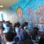
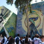
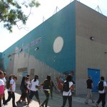
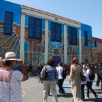
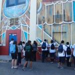
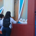
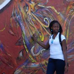
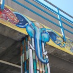
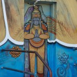
The representatives from Johnnie Cochran’s law firm stressed this morning that JC (yes, he did compare Cochran to the other JC) didn’t want to be remembered by his infamous statement during the OJ Simpson trial. Instead his legacy should be that of stressing the importance of education. In fact it was at this school, originally named Mt. Vernon Jr. High, that Cochran learned the art of debating. The reason for my visit to the school was to celebrate the unveiling of several new murals created by Raul Paulino Baltazar (Otis BFA ’09) and Melly Trochez (current MFT/Art Therapy student at LMU). Raul has extensive experience as an arts educator, particularly with at-risk youth, and completed the Teacher Credential Preparation track of the Artists, Community and Teaching Program at Otis, then under the direction of Jerri Allyn. Although he was not one of my students, I was eager to support him and see what he’s been working on for the last year.
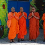
The morning began with presentations by Principal Schmerelson, Johnnie Cochran lawyers (who volunteer time mentoring the schools aspiring debaters), and Raul and Melly. The two fielded questions from the audience of family, friends, press, teachers and most notably “the top” students at the school who will be trained to give murals tours to their peers. One student apologized on behalf of the school for those who threw rocks and soda bottles at the muralists while they began their project. Apparently, once Raul and Melly engaged the students and community in the planning of the mural, they gained their respect and as evidenced by the tour of the school. One school security guard remarked “Isn’t our school wonderful? The students no longer deface it with graffiti!”
All and all the presentations were inspiring and encouraging. The principal referring to Raul and Melly as “World Famous Artists,” the Buddhists monks chanting in front of “The Five Harmonious Friends or Brothers” mural, and Raul encouraging the students to touch the mural on the basketball quart as a gesture of good luck. However, I was surprised by Melly’s choice of words when she tried to encourage female students to push themselves, by stating that through this emotionally and physically draining process she learned “I have my limits. I can’t do everything a man can do.” And I was disappointed to see a few low res images and at least one typo in the brochure produced by Hugo Hopping, who’s supposed to also produce a catalog for the project. But those minor details did not detract from the overall experience of the colorful and complex designs, with diverse symbolism and styles, representing the rich diversity of both Los Angeles and the student body at Johnnie L. Cochran Middle School.
Appointments can be made to see the murals by contacting Principal Scott M. Schmerelson (323.730.4315). You can also call or email Raul himself, but I won’t post his contact info here.


")