
 rss feed
Exhibition at New Puppy Gallery
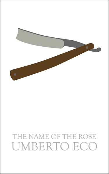
Over at the design/book/writing (not sure really how to categorize them yet) website Venusfebriculosa, they are hosting an ideas competition for a new cover for Umberto Eco’s The Name of the Rose. Eco being one of my favorite authors, I had to give it a shot. The top image here is the one I sent in to their competition. It isolates the theme of deductive reasoning over religious superstition which is present throughout the novel, as symbolized in the principle of Occam’s Razor (I believe it’s Ockam or something in the book). The principle states that the simplest explanation or strategy tends to be the best one, and so that simply led to the design. On the other hand, the razor could serve as a possible murder weapon, and gives some misdirection to the potential reader before they even open the book. Only as they get deeper into the book will they realize the razor is symbolic of the principle, and not a straightforward plot element. Like much of the information parsed by the novel’s protagonist, it is not to be taken merely at face value. A third quality of this item is its distorted resemblance to the cross, slanted as if lain down.
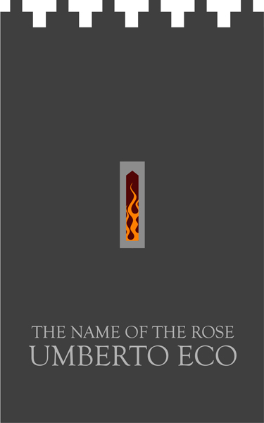
Below is a darker, perhaps more medieval graphic, where the book becomes a monastery tower. In the novel, this is where the library is located, and is central to the plot. The forbidding tower has a slit window, allowing only a fraction of a view into the mysteries of the Abbey. A purifying fire burns within, both a tool of the Inquisition, and a hint of things to come in the book. I ended up sending the other one however, for its simplicity and just in case the fire here was read as a plot spoiler.

Heidi Kayser and I are working on an installation for the Melle Finelli Studio , the opening is March 5, 2010. Melle Finelli and Peter Harris have generously invited us to do a project in their jewelry and art gallery space in Boston’s South End.
Heidi and I have a similar thematic tendencies in our current artmaking. For example, both of our current work is concerned with
-using translucent containers to mediate materials
-interest in biological systems and microscopy
-using repetitive objects as metaphors for individuals
The title is “They believed every word.” It’s like a translation or synonym for “They fell for it, hook, line, and sinker”. (The hook, line, and sinker phrase came up because of the fishing-related materials) With the title “They believed every word” we imagined our viewers questioning their trust of words and mediation in the work. Also the “they” is sort of like the gelcaps, as representatives of individuals.
So now we’ve been installing for about a week, hanging hundreds of the gelcap/fishing line/bell sinker assemblies. It’s going pretty well! It’s exciting to see the work actualized. Ideas and experiments with text and lighting have evololved too. We’re concerned about viewers walking directly into the art and tangling it. It’s quite subtle , so, we’re also mulling over ways to make it clear to gallery goers that they should be careful. The project is going well! 


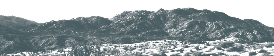
My video installation, Anza-Borrego Expanded Landscape, is showing in a storefront in Long beach this month. It was actually installed in a different storefront down there last month, but I have reconfigured it and moved it to a new one, and this installation is a much better version of it, if I do say so myself. This is part of the Inspired by TED show, and is up in coordination with the TED Conference happening now at the Long Beach Convention Center.
There is a reception tonight, check the Facebook page for more info. See the Phantom Galleries LA Long Beach page here.
Reception: February 13, 2010 for 2nd Sat Art Walk 6-10 pm, 170 N Promenade, 309 Pine ave, Elm and 3rd
Its at the Pike down in Long Beach, which is where Aquarium Way hits Paseo just a block from the Conference Center. My location is across from Sharkys Mexican food and next to the Coldstone. So get some ice cream I guess. Its very subtle and looks like a dark window at first, so keep your eyes peeled. Mapped here.
In case you can’t make it down to Long Beach in time, here are some videos:
For more info on the piece, check my site.

Last weekend Michele and I met up with our friend Roz to check out some of the work showing over in Culver City. A bunch of spaces were open late Saturday in concert with the LA Contemporary Art Fair across town in the Pacific Design Center. We managed to find some great stuff here and there, like the above neon wall piece, ChakrAK-47 by Artemio at LAXART.
At Honor Fraser we were confronted with Gustavo Godoy’s Fast-Formal Object: Big White. The installation is a seemingly random construction of various lumber, dowels, stamped sheet materials and concrete, painted white with its own lights built into it. It reads as a playful study of form, light and shadow, very architectural but also very drawing based, as many of the elements read like various line strokes. With a small platform inside and ramp leading it, it also gives off a constructivist playhouse vibe that keeps the whole thing from getting too serious. We stuck around for a gallery talk on this one, but I found I liked the work much better before I heard the artist talk about it.


Also at Honor Fraser was a projected video piece by Fabien Giraud and Raphael Siboni in which teams of armed combatants battled among a landscape of movable black objects (much like large pedestals or gallery dividers) and theatrical smoke. The groups, costumed as a military contingent, prisoners in orange jumpsuits, civilians, rap-gangstas, and zombies (?) in medical garb (am I missing any? perhaps there were some terrorists too?) played like video game characters brought to life. They ran towards each other across the space, clicking paint ball guns at each other (no added sound effects) and dying by the dozens. Each shot was a continuous tracking shot across the space, gliding smoothly by on rails, starting from the right hand side every time as the groups went through their maneuvers. This one is part of Lab’s inaugural exhibition VideoRoam, a series curated by Paul Young. Lab is a sort of side project of Honor Fraser, “a forum for the explorations of the arts community in and outside of the Los Angeles area beyond the existing gallery program”.


Finally, down at Angles Gallery, among paintings I didn’t care for at all, we found this little gem of a wall sculpture by Tom LaDuke – a delicate little bit of twig somehow mirrored as if hanging above the surface of a still pond. Around the corner from this, a vertically oriented video proved to be the highlight of our tour. In crisp HD, a still life with hanging bird, grapes, water and plaster wall turns out to be a super-slow-motion shot of the bird simply dropping into the water below. The details of the feathers, the water splashing out into droplets, the sheen of the grapes, recalled old master’s still life painting – and more recently Bill Violas interpretations of the master’s at his Getty residency – but still managed to stay in itself a captivating work.
(hm. I didn’t write down the name of the video artist and now I can’t find it on their website.. same for the above projection. What is it with galleries snubbing the video artists on their websites? Unless I am just missing something)


A while back I designed a logo for my friend Kathleen Greenberg, an interior designer I have worked with on various projects through two different offices. I did this business card design for her too, just because I felt like it. I don’t think she is actually going to use it, but I like the potential of the prints of different materials used in her work for the back of the cards. The intention would be to curate and design a series of backs (these two are more placeholders) that relate directly to materials and patterns she has used on projects. Front is simple and straightforward with an understated but elegant font. Check out her work here.


Here are a few images from the MexiCali Biennial that opened at Otis College of Art and Design’s Ben Maltz gallery last weekend:
From the MexiCali website:
“The MexiCali Biennial is a non-profit organization that aims to provide a platform for border crossing, progressive art exhibitions and events. These interventions, installations and performances encourage dynamic cultural exchanges that resonate within the fluid context of the territory covering Mexico and California. Concentrating on the border as the site of transgressions, this biennial distinguishes itself by tapping into a unique aesthetic derived from a culture of art and critical dialog evolving from the confluence of both countries in a region defined by its hybridism.
The first MexiCali Biennial took place in Mexicali in 2006 with the idea of producing an exhibition featuring artists from California and Mexico. The addendum of “Biennial” was a deliberate political choice—to add to an art show in Mexicali a term that came with the baggage of art-world prestige and exhaustion, a Biennial at a time when no one could stand the thought of another one. The aim was to provide artists with an opportunity to respond and transgress the overarching environmental context of the production and display of their work with a notion of conversation that engages both with the heavily funded and institutionalized Biennial framework and the less formal and often more innovative process of bi-national exchange that happens every day.”


Yeah, yeah. Vacation is over, Winter Winter (2+ feet of snow right before I left) has been traded for LA Winter (awesome out with a chance of rain.. actually pouring right now with I-kid-you-not a 2 foot deep lake around my parked car). Not working and not connected to teh internets (parents house was a 2-week internet black-out during which I read a lot) has been traded for working working working working, hopefully some of which will be billed at some kind of hourly rate, some of which will be traded for, uh, street cred(?) and some of which will be chalked up to well I was going to do that anyway so who cares if no one’s paying me for it.
So. Its already busy back at the Rise Studios, with Michele furiously editing a freelance video project in between Otis responsibilities, which I am supposedly going to review tomorrow for sound and further editing, me trying to make my way through several hundreds of pages of technical structural study guide so that I can pass that exam when the time comes, also while looking into all the nooks and crannies around Los Angeles for the mythical, aforementioned Work That Pays which when found will sustain the lifestyle of care-free-artist-architect-musician-designer that is after all how I roll. Oh, and I got some super-cool digital sensors in the mail today so that I can rig up some Sci-fi hi-tech bio interface thingy to some syth software (ala the Vivarium project). PLUS! Still need to put on my nerd goggles and solder up a kick-ass synth project that has been sitting on my desk mocking me for about three months now. That and a handful of little Radio Shack style kits that when assembled will allow me to sonically influence the outcomes of both past and future events. What else? Web design continues for my own site which is filling up with content and not yet really designed (that’s the half-assed version as it is, and might just stay that way). Hmm. I think I completely lost the flow of that sentence-paragraph there. But you get the idea.
So, lets just say Two Thousand and Ten is off to a helluva start, and check back in here shortly when I have some actual news to post out to ya.

