Lately I’ve been realizing that Suzanne Oshinsky and I share an interest in depicting language and misunderstandings while actively engaging the viewer, and her recent text-based work is very intriguing to me. In particular, her flash animation, Eye-dew-knot-no, recently on view at Light and Wire Gallery, forces the viewer to make mental leaps while reading passages of text with select words switching back and forth between their homophones. Each homophone is a hyperlink, which when clicked on brings the reader to additional passages of a seemingly disjointed narrative. The process of reading becomes more active than passive, as if one is simultaneously reading and translating a second language. At first this process of decoding text is more present than the narrative itself, however depending on which homophone is clicked the next screen might repeat something already read, allowing for second and third reads which brings the scenes and scenarios depicted into vivid focus in the reader’s head. Eye-dew-knot-no reads like an email from my father-in-law, with his practice of purposefully using the wrong homophone, and Oshinsky has been interested in these misreadings in other recent work, but the complexity in both form and content is what makes this animation more successful.

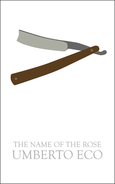
Over at the design/book/writing (not sure really how to categorize them yet) website Venusfebriculosa, they are hosting an ideas competition for a new cover for Umberto Eco’s The Name of the Rose. Eco being one of my favorite authors, I had to give it a shot. The top image here is the one I sent in to their competition. It isolates the theme of deductive reasoning over religious superstition which is present throughout the novel, as symbolized in the principle of Occam’s Razor (I believe it’s Ockam or something in the book). The principle states that the simplest explanation or strategy tends to be the best one, and so that simply led to the design. On the other hand, the razor could serve as a possible murder weapon, and gives some misdirection to the potential reader before they even open the book. Only as they get deeper into the book will they realize the razor is symbolic of the principle, and not a straightforward plot element. Like much of the information parsed by the novel’s protagonist, it is not to be taken merely at face value. A third quality of this item is its distorted resemblance to the cross, slanted as if lain down.
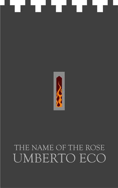
Below is a darker, perhaps more medieval graphic, where the book becomes a monastery tower. In the novel, this is where the library is located, and is central to the plot. The forbidding tower has a slit window, allowing only a fraction of a view into the mysteries of the Abbey. A purifying fire burns within, both a tool of the Inquisition, and a hint of things to come in the book. I ended up sending the other one however, for its simplicity and just in case the fire here was read as a plot spoiler.
