Printing Guilloché
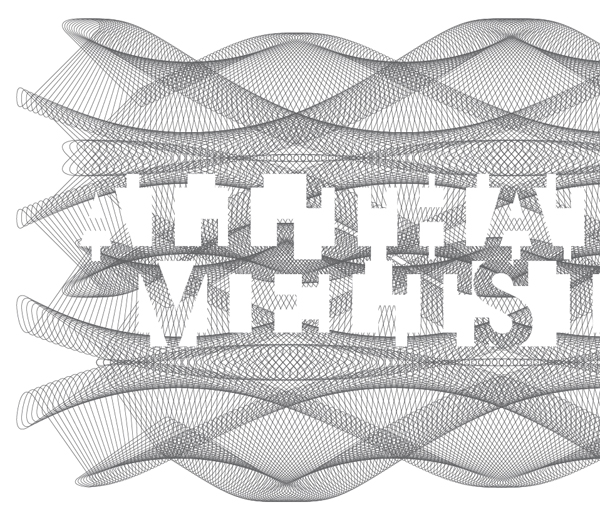
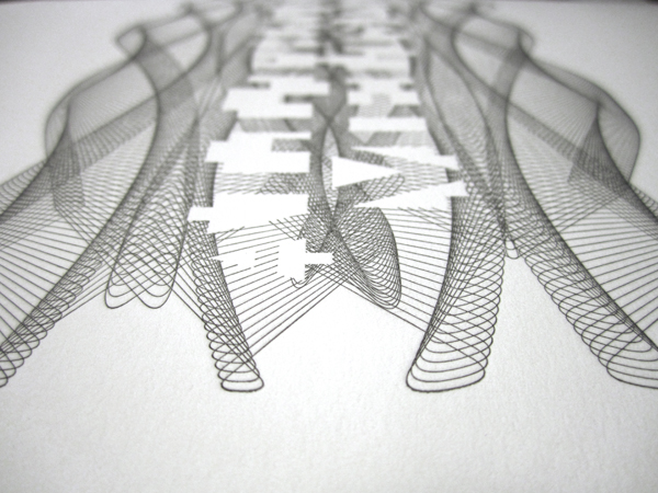
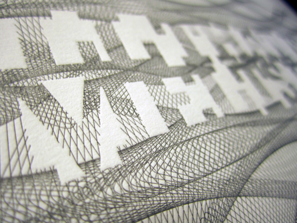
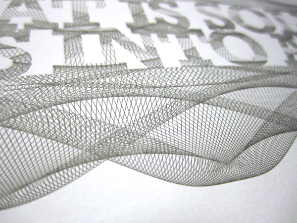
For my second print in the letterpress class I have been taking over at Otis, I wanted to work with Guilloché patterns – those complex geometric patterns used on currency and other documents for increased security against forgery. I looked into some different software for creating these mathematically based patterns, but then decided to just see what I could create using Illustrator’s “transform each” tool. I started with a square, rotated that 45 degrees, and then drew some flat, elliptical loops off the end of each point – so now I had a shape that looked like a continuous looping line with a geometrical basis. I simply took that, grouped it, and had “transform each” rotate it a degree or two and move it two points on each step. I repeated that until it ran all the way across the page. This gave me a very satisfactory pattern. I then copied that, flipped it, and nested it under the first line to fill in any white space between them. For the last step, I mirrored this whole thing down, and pushed them together again so there was no empty space between them.
I made sure my lines were all set at a hairline (.25 pt), and stared to work on the text.
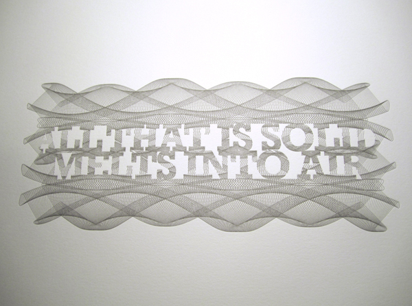
For the text, I laid out my quote in a separate file, added some boxes around, then merged all the outlines. I copied out only the white spaces, and dropped those on top of the Guilloché pattern to re-create the text with the linework.
I was pretty happy with that, so I sent it out to get a film made. Gerald from Bieler Press had told me he can do a plate with hairlines no problem, so I had set up the linework with that in mind. I figured this would test my ability to print fine linework pretty well. I picked up the place from Bieler, and it looked perfect. Now all I had to do was print the damn thing.
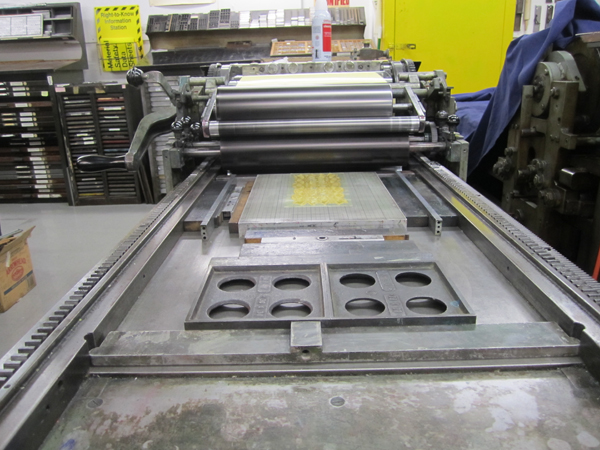
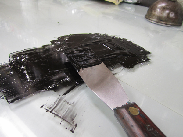
I got into Lab Press at 2pm. Needed to get the typan changed, and Leslie was kind enough to do that for me. So I started in on cleaning and set-up around 2:30. Got it all together, made myself some ink, and ran my first proof. It actually looked pretty good. Very light, way off center, but the lines were coming in clear!
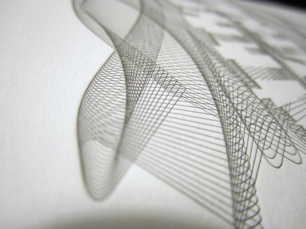
Now I had to locate the print in the right place on the page, get the impression right, get the ink right, and fix any other problems that came up. Seems like every possible problem came up. For some reason, I had a hell of a time getting the right location, I think my simple math and spatial skills were completely off that day. The plate got dirty and needed to be cleaned off. Rollers kept being wrong. Needed more and more impression. The ink dried on the rollers while I was messing with everything else and so I had to clean them all off and re-ink them. It was getting there, then things just started looking bad. This was around 7pm. Five hours in. Gerald told me lower the rollers, and switch out all my packing (the layers of precise thickness paper taped on to the typan to achieve the right impression). The packing was going to be an ordeal so I just ran one more first, to see how it came out. And suddenly, it was good. No idea why. Must have been just the rollers, and needing to work some prints through to get the ink coverage right? I don’t know. But it was good, and it kept being good. Needed some ink now and then, and some finesse with how many times I tripped (ran the rollers over the plate to ink) but I managed to keep it up through the rest of my stack of paper.
So now I have a beautiful stack of these 8-1/2 x 11 prints. Karl Marx quote from the Communist Manifesto over currency/banknote inspired Guilloché pattern. More delicious irony suitable framing and hanging either in the boardroom on Wall Street, or at your local Communist Headquarters – your choice! Will post these up for sale soon on the shop portion of Jeremyjquinn.net so check in there in a few days if you want your very own!


